| Author |
Message |
Comments: 44
Blockland ID: 41955 |
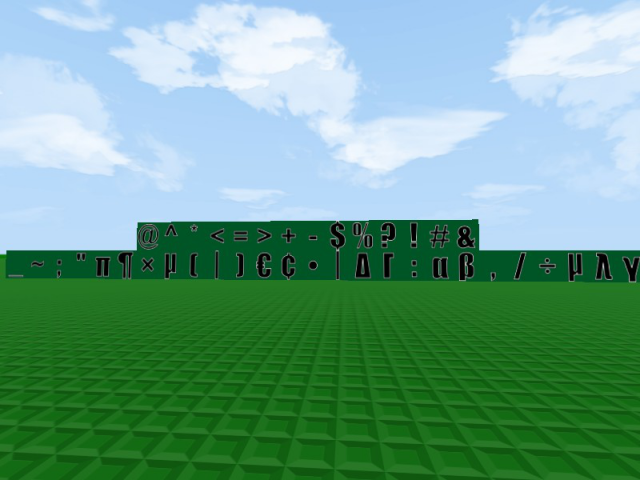
 Posted: Thu Aug 08, 2013 12:46 am [color=00FF00]these are just symbols![/color] |
|
 |
 |
Comments: 21
Blockland ID: 36157 |
Posted: Sun Jul 07, 2013 7:40 pm |
|
|
|
Comments: 23
Blockland ID: 26581 |
Posted: Sat Sep 10, 2011 7:37 pm You know, I think this look much professonal than the default lettering in Blockland. :) |
|
|
|
Comments: 89
Blockland ID: 26746 |
Posted: Mon Aug 01, 2011 2:12 pm |
|
|
|
Comments: 48
Blockland ID: 26659 |
Posted: Sat Apr 16, 2011 4:13 pm @thecabeguy
It works just fine, if you read the DESCRIPTION, it says you have to DISABLE THE DEFAULT LETTERS.
Not to mention almost EVERYTHING I've ever seen from you is negative. I'm pretty sure nobody ever cares about your opinion because you just say everything sucks and don't provide a reason. Go back to Roblox where you belong.
Nice reporting for no reason. You troll. |
|
|
|
Comments: 1238
Blockland ID: 16842 |
Posted: Thu Mar 31, 2011 3:07 pm @Pwnzord
It's bargain-binned because it sucks.
And now, i've also figured out that it doesn't work either. Reported. |
|
|
|
Comments: 48
Blockland ID: 26659 |
Posted: Tue Mar 29, 2011 2:09 am @General_Ardolf
Was that a compliment or an insult? |
|
|
|
Comments: 126
Blockland ID: 18368 |
Posted: Mon Mar 28, 2011 1:41 am |
|
|
|
Comments: 388
Blockland ID: 4666 |
Posted: Mon Mar 21, 2011 6:05 am This is impact rite hear! |
|
|
|
Comments: 48
Blockland ID: 26659 |
Posted: Tue Mar 15, 2011 7:12 am @Pwnz0rd
I was asking myself the same question..... I wish mods provided reasons for bargains.... |
|
|
|
Comments: 26
Blockland ID: 26925 |
Posted: Tue Mar 15, 2011 6:15 am Why was this Bargain Binned? Its AWESOME! |
|
|
|
Comments: 437
Blockland ID: 14205 |
Posted: Tue Mar 15, 2011 12:42 am |
|
|
|
Comments: 24
Blockland ID: 19406 |
Posted: Mon Mar 14, 2011 11:29 pm HAY GUISE LOOK, ARIAL BOLD AND IMPACT. THE DIFFERENCEEEEEEE |
|
|
|
Comments: 48
Blockland ID: 26659 |
Posted: Mon Mar 14, 2011 10:49 pm @bob13
But Arial is too standard and normal looking, even Arial Bold. I like Impact better.
@Cannon666
Thanks, but I don't think I can make RTB letters due to the face RTB's logo does not have a real font. They just photoshoped those letters, I believe, but correct me if I'm wrong.
@all
Thanks, I didn't expect people to love this so much! :D |
|
|
|
Comments: 388
Blockland ID: 4666 |
Posted: Mon Mar 14, 2011 4:11 pm Hey dude, just use ariel bold! |
|
|
|
Comments: 8
Blockland ID: 27312 |
Posted: Mon Mar 14, 2011 12:54 pm It's just like the Blockland Logo try and make letters like the RTB logo 5/5 |
|
|
|
Comments: 216
Blockland ID: 9688 |
Posted: Sun Mar 13, 2011 9:09 pm |
|
|
|
Comments: 57
Blockland ID: 25231 |
Posted: Sun Mar 13, 2011 4:23 pm |
|
|
|
Banned
Comments: 34
Blockland ID: 20948 |
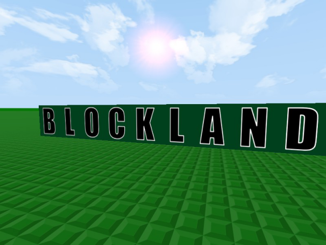
Posted: Sun Mar 13, 2011 4:22 pm Blockland's letters!
Great job. |
|
|
|
Comments: 29
Blockland ID: 19543 |
Posted: Sun Mar 13, 2011 4:06 pm |
|
|
|
Comments: 297
Blockland ID: 6835 |
Posted: Sun Mar 13, 2011 1:18 am I like that it has more symbols |
|
|
|
Comments: 204
Blockland ID: 14951 |
Posted: Sat Mar 12, 2011 10:19 pm |
|
|
|
Comments: 48
Blockland ID: 26659 |
Posted: Tue Mar 08, 2011 5:51 am No first comment for you! Also, can someone tell me why this was bargained? Is it because it's the old disproportional version? In that case v2 fixes that, and I fixed the Z as well. |
|
|
|
|


")
")
